Richard Dyer came up with the idea that all artists have a certain star image which is usually seen through their videos, website and digi-pack. A star image helps them appeal to a certain audience whether this be a mainstream or niche one, the ways in which this is achieved is they way they not only present themselves but the way they show and sell their media products. Having a star image means that the artists can have a stronger connection to their audience as maybe consumers feel they can relate to them as they dress the same or are into a similar style as the artists. Dyer also mentions that artists are usually influenced by their record company to present themselves in certain ways in order to make sure that they do target a specific audience in a more successful way. Also if we look into the work of Negus who talked about organic and synthetic artists, we can see how artists may reveal themselves in certain ways in order to be liked by different audiences and that if they choose to be synthetic then they are going to have a more mainstream audience where as if they decided to be organic then they would expect to have a more niche audience. Both these theories can help when looking into the star image or our own band, Reverie.
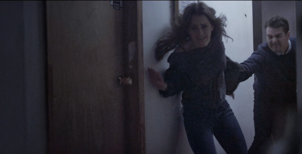
 We knew that the star image of our band would be indie and also quite grungy and therefore we kept this in mind when creating our music video. We knew that we would be creating a product that would be of interest to more of a niche audience and therefore we decided to keep the overall look quite de-saturated which made it come across dark and grungy. When looking at the artist Birdy we saw how she used very de-saturated and cold colours therefore we decided to do this with ours as it portrays the star image of the band to be more indie and organic. In addition to this we wanted a very abstract video meaning that the narrative was kept simple yet ambiguous with there being a strong focus on water and inks, which helped with the indie genre that we were in hope of creating and also made it look cinematic. In relation to Negus’ theory we would say that our band is very organic this is clearly seen by there being more of a focus on the narrative rather than the performance element, highlighting their want to sell their music rather then themselves, plus even when the band is shown on screen they are hidden by the multi-coloured inks which adds to this idea. When looking at the music video Breeze Blocks by Alt-J we saw that their video was very focused on the narrative and actually throughout they didn't show themselves and therefore we too though that it would be a good idea to decrease the amount of times the band were present in the video. Furthermore their clothing is very dark and low key not only presenting their style as grungy but also meaning that they are shown to be to be very chilled out people. Also by the fact that they are shown on a much whiter and lighter background in comparison to the narrative they are therefore presented in a positive way and whats more highlights that even though they could be seen to have a slightly moody attitude that they are in fact a band that is approachable.
  For the website, we wanted to make it very simplistic to keep in theme with the video. Therefore the choice of the colour scheme was different shades of grey which meant that it was a very neutral looking format and helped portray their indie/grunge style. Biffy Clyro - who is also an indie artist uses a simple grey colour scheme on their website and therefore we got inspiration from this and also the band Bastille have a very simplistic format and dark colour scheme so we also used this to help us when designing our website. What's more the ‘behind the scenes’ page meant that the band is presented as very open and willing to share everything that goes on to their audience and this then creates a community online as everyone can keep up to date with where the band is and what they are up to. The images of the band present them as close and also as they are smiling this helps them show viewers of their easy going and care free attitude. The images on the home page aren’t all of just the band and include ones of the shoot day of the music video, which again suggests the band wants to focus on what they make rather then themselves, clarifying them as organic artists.
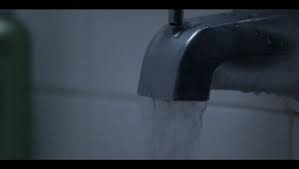
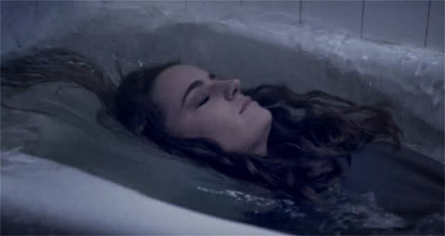
  The digi-pack again keeps in theme with the music video and website, this is because there is a clear abstract and indie theme which is kept throughout, in addition the font is the same as the one used on the website. However after looking at 4AD - which is where the original artists of our chosen track are from - we saw that this record company is famous for their album artwork and particularly Vaughn Oliver’s album and when looking at this we saw that there was the inclusion of colour and this actually made the album look more interesting. Therefore as a product to sell we though that we would do the same with our digi-pack and so we included the image of the different inks being dropped into water as our back cover and also in photoshop we made it look as though there were multi-coloured inks being dropped down over the artists - this also made a strong link to our music video. As for the front cover we wanted to keep in very simple and therefore it was an image of a girl in a bath, which again linked in with the music video nicely and the fact that it was very de-saturated made it appear very grey in colour which kept in the theme of the star image of the band.
The overall look that was achieved through the music video, website and digi-pack was kept constant throughout all three products which helped us achieve a stronger star image and therefore a much more clear target audience.
No comments:
Post a Comment