Thursday, 27 March 2014

Final digipak - Front cover, inside panels and back cover


Our digipak design focuses on the contrast of de-saturated colour and bright watered down inks, both of these qualities are seen in our music video. The pack also is made up of three separate shoots that I shot over the production and post production stages.

The front cover image is an image with is connected with the video itself. We decided to use this as the front cover even tho it is not a single album because we felt as tho its a strong image. I used the app fragment by pixete LLC on the IPAD to produce the design of the image. I also used the same format for the back-cover  The back cover image was one I took when doing the ink experiments before our shoot. The image consists of a range of coloured inks being dripped into water. Using the app I selected the design I wanted and formatted the image to fit this. However, on the front cover I decided that the most effective way to display the image would be to have the picture itself in focus and the parts of the image in the lines blurred out. While on the back cover I felt the most visually compelling way to present the image would be to have the main area out of focus and the parts of the image in the lines in focus. This also meant that we could have the other songs in the album written in-between the fragmented square lines.

The inside left panel consists of images that I took in the studio which also went up on the website. I chose to put these images in black and white and in photoshop using the blending tools place the allusion of ink dripped down the background to link with the back cover as well as the video itself. This made all the the panels link better. 

The inside left and the CD design I felt it would be appropriate to bring in some sort of connection with the water as there has been some sort of reference with the water in each of the other panels. So therefor, I placed a water image on for the CD and using the front which I have used throughout I smudged in photoshop to give the effect that the water is making the ink run. 

Through the making of the digipak I completed many different drafts using various images and designs to see what was the most effective. Through stages of development and refining I came up with the final design. 

Monday, 24 February 2014

TASK 4 SCRIPT: How did you use media technologies in the construction and research, planning and evaluation stages?

How did you use media technologies in the construction and research, planning and evaluation stages?

Research: We chose our track and discovered it was part of the indie/dream pop genre and therefore this is what we focused on whilst making our video.  

After creating a storyboard on paper we filmed it with the SONY NX5 in order to create a digital animatic that we edited and cut together on the soft wear final cut pro in time to our music. The purpose of this was to see how the length of the shots worked with the music and see if there were many vital changes we needed to make, in order to improve the story line before the day of the shoot. We stuck to this animatic as it was vital on the shoot.
We also had to cut the length of our track as the music was too long for the length of the video; we used the software ‘Sound Forge’ for this.
The photographs were essential to the concept of our video and were taken on the groups IPhones as well as on an SLR camera. We then got these double printed, so we had 400 photographs to fill the room.

Production:
We filmed most of our footage on the FS100, but our video also contained a lot of slow motion footage, which was filmed on the NX5. When filming the performance element we had to use the Ipad to play the music out loud which would help later for the lip sync in post-production, and we also had to use the digital clapper so when we played it back we knew where we had to start editing from. We also took photos on the shoot day using a Cannon 5D, as we wanted to record what we had done on the shoot day as well as take photos for our website.
Some of this footage was shot on a crane from above as we wanted to use a birds eye view shot so you could see the whole set, this was taken on the Sony FS100 and in the bathroom most it was most filmed using the NX5 due to the slow motions. While filming this there was a TV screen next to us so that we could make sure we liked what we were filming as we went along.
Post Production:  We used the soft wear final cut pro to edit our product together. We created different rushes and bins to make it easy for each clip to be found. Using the different channels, we used the appropriate clips and inserted them into the suitable places.
We also learnt how to use lip sync which we had done an activity on earlier on in the year. We placed the narrative of the video down first as we felt that this was the most important element of our video as it was the most visually compelling. After we created a first rough cut we evaluated what areas we needed to improve or completely change to make it the best we possibly could.
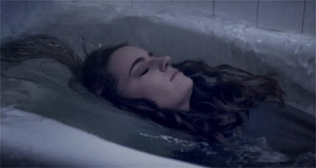
We used the soft wear ‘After effects’. We used this software to create visual effects in order to bring together three separate plates and using the dissolve tool we created the illusion that the main girl was dissolving into the bath. This appeared at the very end of the music video.
We also used the program ‘colour’ to adapt the finishing, colouring and grading. We de-saturated the colours to create a blue tinted finish, this created a morbid effect.
(We used a range of techniques such as; channel layers, blading, marking, synching, different rushes and bins, slow motion shots, changing the saturation and filters in order to create a successful and creative product.)


Thursday, 6 February 2014

TASK 2: How Effective is the combination of your main product and ancillary texts?

 
Richard Dyer came up with the idea that all artists have a certain star image which is usually seen through their videos, website and digi-pack. A star image helps them appeal to a certain audience whether this be a mainstream or niche one, the ways in which this is achieved is they way they not only present themselves but the way they show and sell their media products. Having a star image means that the artists can have a stronger connection to their audience as maybe consumers feel they can relate to them as they dress the same or are into a similar style as the artists. Dyer also mentions that artists are usually influenced by their record company to present themselves in certain ways in order to make sure that they do target a specific audience in a more successful way.  Also if we look into the work of Negus who talked about organic and synthetic artists, we can see how artists may reveal themselves in certain ways in order to be liked by different audiences and that if they choose to be synthetic then they are going to have a more mainstream audience where as if they decided to be organic then they would expect to have a more niche audience. Both these theories can help when looking into the star image or our own band, Reverie. 
   
 
We knew that the star image of our band would be indie and also quite grungy and therefore we kept this in mind when creating our music video. We knew that we would be creating a product that would be of interest to more of a niche audience and therefore we decided to keep the overall look quite de-saturated which made it come across dark and grungy. When looking at the artist Birdy we saw how she used very de-saturated and cold colours therefore we decided to do this with ours as it portrays the star image of the band to be more indie and organic. In addition to this we wanted a very abstract video meaning that the narrative was kept simple yet ambiguous with there being a strong focus on water and inks, which helped with the indie genre that we were in hope of creating and also made it look cinematic. In relation to Negus’ theory we would say that our band is very organic this is clearly seen by there being more of a focus on the narrative rather than the performance element, highlighting their want to sell their music rather then themselves, plus even when the band is shown on screen they are hidden by the multi-coloured inks which adds to this idea. When looking at the music video Breeze Blocks by Alt-J we saw that their video was very focused on the narrative and actually throughout they didn't show themselves and therefore we too though that it would be a good idea to decrease the amount of times the band were present in the video. Furthermore their clothing is very dark and low key not only presenting their style as grungy but also meaning that they are shown to  be to be very chilled out people. Also by the fact that they are shown on a much whiter and lighter background in comparison to the narrative they are therefore presented in a positive way and whats more highlights that even though they could be seen to have a slightly moody attitude that they are in fact a band that is approachable. 

For the website, we wanted to make it very simplistic to keep in theme with the video. Therefore the choice of the colour scheme was different shades of grey which meant that it was a very neutral looking format and helped portray their indie/grunge style. Biffy Clyro - who is also an indie artist uses a simple grey colour scheme on their website and therefore we got inspiration from this and also the band Bastille have a very simplistic format and dark colour scheme so we also used this to help us when designing our website. What's more the ‘behind the scenes’ page meant that the band is presented as very open and willing to share everything that goes on to their audience and this then creates a community online as everyone can keep up to date with where the band is and what they are up to. The images of the band present them as close and also as they are smiling this helps them show viewers of their easy going and care free attitude. The images on the home page aren’t all of just the band and include ones of the shoot day of the music video, which again suggests the band wants to focus on what they make rather then themselves, clarifying them as organic artists. 

The digi-pack again keeps in theme with the music video and website, this is because there is a clear abstract and indie theme which is kept throughout, in addition the font is the same as the one used on the website. However after looking at 4AD - which is where the original artists of our chosen track are from - we saw that this record company is famous for their album artwork and particularly Vaughn Oliver’s album and when looking at this we saw that there was the inclusion of colour and this actually made the album look more interesting. Therefore as a product to sell we though that we would do the same with our digi-pack and so we included the image of the different inks being dropped into water as our back cover and also in photoshop we made it look as though there were multi-coloured inks being dropped down over the artists - this also made a strong link to our music video. As for the front cover we wanted to keep in very simple and therefore it was an image of a girl in a bath, which again linked in with the music video nicely and the fact that it was very de-saturated made it appear very grey in colour which kept in the theme of the star image of the band. 

The overall look that was achieved through the music video, website and digi-pack was kept constant throughout all three products which helped us achieve a stronger star image and therefore a much more clear target audience.


Friday, 31 January 2014

Final Cut Evaluation


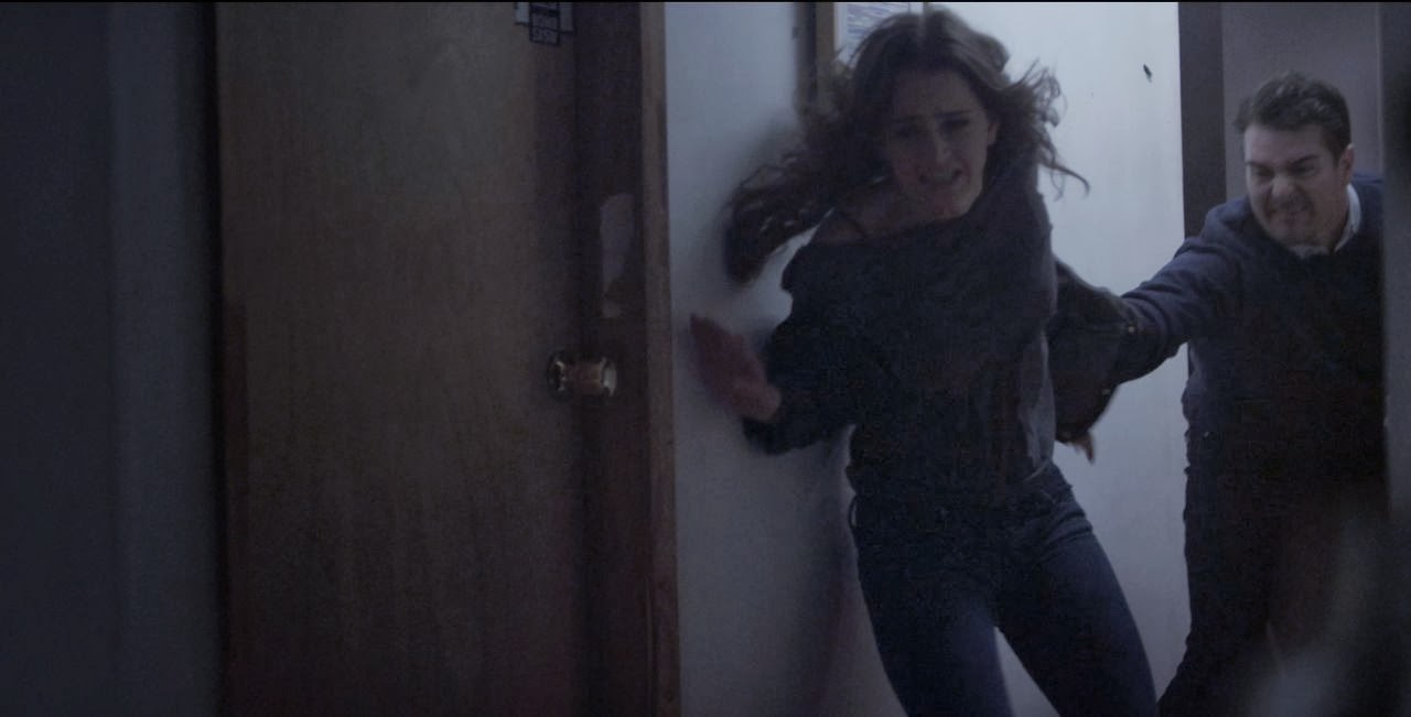
After watching through our rough cut there were some changes that we needed to make, one was that there were a lot of continuity errors which meant that it was maybe slightly awkward to watch. For example Isa gets out of the bed but then we saw her back in it again, also water is flooding into the bedroom onto the pictures in shots that came before we saw that there was a bath or before the bath is seen to have over flowed so this didn't make too much sense. Therefore we fixed this by moving shots around so showing a shot of the taps being on and the bath over flowing before we saw any water in the bedroom. We also found that the whole sequence happened very quickly meaning that maybe she gets into the bath way before she actually should as we were left with a lot of room at the end that we didn't know what to do with and also that we hadn't included really effective and cinematic shots in the bedroom that we could have put it. So we made the start more spaced out and made it so that she isn't seen going into the bath until later on in the video, this worked much better as it meant that after this shot we didn't have too much footage we could put in as she goes under water and this is how it finishes so once she was submerged we had to finish it quite quickly.
We also found that the lip syncing wasn't also on point which needed to ne changed it is just made the whole music video look a lot more unprofessional as it became obvious that these the two artists were not actually a band and that she was just singing and he was just playing over a track. This was easily changed by using the time proxy to help us get the shots in time with the track. 
The big change though was doing the special effect at the end of Isa dissolving into multi-coloured inks in the bath, the way we did it is on the shoot day we took a birds eye view shot of the girl fully under the water lying in the bath and then we took a birds eye view shot of the bath when it was empty as well, by using these two templates an effect called bubble dissolve was used to slowly move from one shot into the other. But the next step was the ink, on the shoot day we had made ink bombs which exploded in the bath producing this mixture of ink swells in the bath which could be used to know the colours that we wanted to use but for the ink to actually dissolve this girl,what happened was that we turned small parts of her into blocks and dissolved it and then went on the amplify the colours and make it more obvious as to what was happening to her.
 
Also what we did was use a process called colouring - which is done on an American programme called ‘Coloring’. What it does is change the amount of colours so that they match each other, therefore as we used a lot of white and sometimes the whites wouldn’t match up - maybe because of the time of day had changed or there was a slightly different light set up, etc. - this is when we can use this process so that the colour balance in the image looks correct. Colouring was also used to make it look quite de-saturated and dark in order to keep the style for one quite grungy and also emphasis the dark and troubled message that we are presenting in our music video, we thought de-saturating it would pull off this look after watching the music videos that Birdy had done which use a similar colour process.

Monday, 2 December 2013

Fineshine Ruff Cut


Audience Feedback

The audience which I showed our ruff cut to really loved it. They thought that the footage which we had got was very meaningful and worked very well with the choice of song. They could tell what the narrative was about which meant that the editing was done well due to the fact they could tell the storyline. There is a few weaknesses and they were down to timing in the rough cut. We took footage of some of the same shots when the floor was wet and dry and we got a bit muddled when editing this footage. The audience noticed that we need to change one of the shots from having dry floor to wet floor as the bedroom has flooded at this point. I agree that we need to go back and just keeping checking what shots have been flooded and which ones haven't.

What do you think of the footage?

I really like the footage and I think it works well with your song. It's interesting to watch and you don't get bored at all watching the video. The shot which I like the most is the Ariel shot of Isa in the bed.

Can you tell what the narrative is?
Yes, it's a very clear narrative, the only thing which I've noticed is that at one point when the bedroom has flooded, there is a shot where the bedroom goes back to being dry. This doesn't make much sense, so I think this may be a mistake.

Do you think the editing fits well with the song?
Yes, it all flows really well, there is a part where Isa pulls her hand together and the lyrics read 'and pull' which fits particularly well. The band footage works really well with the other parts and has been edited in to work well with the lip sync as it looks like the singer is really singing. There is only one part towards the end of the song where the  singer is slightly out of time but it just needs changing very slightly.

Is there anything you think we could improve on?

I think all you need to work on is making sure that the timing on everything works well and make sure that it flows slightly better than it does at the moment. I think the shot where the taps are running doesn't look quite right and maybe should be swapped for another shot. It's not a very interesting shot as well as not looking as clean as the others. Also towards the end its a bit mix and match. It needs to be flow more towards the end and needs something to happen with the last shot.

What's your overall view?
I really like it and I don't think there is much to do. If that was your final piece I would be surprised. The editing has been done really well and the footage is amazing. The storyline makes sense however i do think that there are some cuts in there that need to be changed and adapted in order to make it flow better.